Thứ Hai, 8 tháng 11, 2010

Tiny Landscape Nuts and Bolts

This is an answer to the questions from Petr and Vicki from the previous post (by the way, I appreciate all the kind comments, and the haiku, Dan!)


Anyway, the tiny landscapes were done with a mixture of watercolor and water-soluble colored pencils. I usually start with a quick lay-in using a brown Caran-d'Ache pencil. The watercolor is a Schmincke half-pan set.

Then I painted the sky with a flat watercolor travel brush. The brush is the gold metallic thing just to the right of the rows of paints. It divides into two pieces, with the handle acting as a cover and protector for the brush tip when stored. I also used a Niji water brush for softening some areas.

Then I painted the other big shapes of the landscape with watercolor, and added detail and foliage texture with the colored pencil. The notes are written with the blue Waterman Phileas fountain pen (filled with brown ink) that's just visible above the Moleskine watercolor book.

The rag is a scrap of cotton flannel, and the cup is a Nalgene plastic jar.

Sorry, the Mac iBox (upper right) is a prototype only, and is not for sale.
----------
Previously on GJ: How to refill a fountain pen.

Tiny Landscapes


Traveling often gives you time in 15 minute intervals. This morning, for example, I found myself on the train platform in Bourges from 7:25 until 7:39 AM.


But that’s enough time for a painting the size of a postage stamp. I got out my Moleskine watercolor book and the other little tools that I keep in the side pouch of the computer case.


There’s the painting on the far right of the second row (click to enlarge). A few minutes later the TGV train passed farms near Vierzon, where the lights of the houses still glowed. The landscapes—and the weather—changed moment to moment.

This is a really fun way to work if you want to tackle new subjects, or to try a new medium, or to explore new compositional ideas.

Chủ Nhật, 7 tháng 11, 2010

Bourges Watercolor

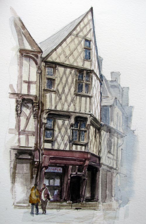
We set up our folding stools in the middle of the old section of Bourges, France, yesterday, looking toward the half-timbered houses that were built soon after the great fire of 1487.

I spent the first hour working out the pencil drawing on the 6x8 inch Moleskine watercolor book. I then laid very light washes in gray and brown, leaving the white of the paper only in the far, upper plane of the central building.

Then, starting with the very dark doorway, I painted the structure area-by-area. The whole painting was done with a folding travel brush, a 1/4 inch flat. The flat, chisel shape can be used edge-on for a fine line, or full-width for wider shapes, such as the reddish brown sill piece at the top of the first floor.

In the final painting I lightened the further buildings on the right side, both to vignette the subject and to give a sense of fog.

Thứ Bảy, 6 tháng 11, 2010

French Bulldog

This little fellow was a passenger on the train from Nantes to Bourges yesterday.

 
His owner had a little blue padded bed for him and encouraged him to sleep, but he preferred to glance out the window. When I made bird-whistle noises, he looked over at me so I could do his portrait.

Half-Timber Message


Can you find the name of an American university hidden in the half-timbering of this unretouched photo, taken in Bourges, France?

Thứ Sáu, 5 tháng 11, 2010

Color and Light Flip Through

Thanks to BoingBoing for picking up my scoop about the new iBox!

And thanks to Spectrum for the nice video flip-through and review of Color and Light: A Guide for the Realist Painter.


Spectrum writes:
"Based on Jim's enviably popular blog, this book slices though the confusing and often contradictory dogma about color with laser-like precision and backs it all up with some astonishing examples of Gurney's own paintings as well as with a welcome (if brief) survey of underappreciated masters who perfected how light reveals form and content. Color and Light is another gotta-have-it book for anyone who wants to paint, anyone who wants to improve their painting skills, or anyone who simply want a better understanding of the creative process."

Color and Light: A Guide for the Realist Painter (Signed from Dinotopia Store)
Color and Light from Amazon
Spectrum: The Best in Contemporary Fantastic Art

Thứ Năm, 4 tháng 11, 2010

The New Mac iBox


Look what someone accidentally left in a laundromat in Italy—a working prototype of Apple’s much-rumored new iBox, ahead of the official launch.

It’s a lot smaller than the MacBook Pro, and even a bit narrower than the iPad. The design of the outside is very simple, with no connection ports at all. It keeps to the same simple brushed aluminum look with rounded corners. It’s a bold step into the wireless, portable, creative suite market.


When you open up the hinged upper lid, the iBox interior is filled with 29 different graphic art tools, each of which responds to a variety of hand movements. The interfaces are fairly intuitive, with a variety of mark-making potential.

Problems: The hue range is limited. The receptive surfaces will be sold separately by third party vendors. And the the gray undo tool isn’t compatible with all the rendering devices.

Thứ Tư, 3 tháng 11, 2010

Piccoli Ritratti

Here are some little portraits of some of the amazing people we had supper with in Lucca:

1. The incomparable comic artist Massimiliano Frezzato, creator of I Custodi del Maser, 2. Terry Brooks, author of Sword of Shannara, 3. Emanuele Vietina, vice-director of Lucca Comics and Games, and 4. Steve Perrin, game designer for Dungeons and Dragons and RuneQuest.


Also: 1. Skippy, 2. Mandy, 3. Athos, and 4. Andrea. These sketches were all made with water-soluble colored pencils, and all were drawn around the supper table (except the one of Skippy, which was a workshop demo).

Lucca Comics and Games

Thứ Ba, 2 tháng 11, 2010

Exhibition at the Lucca Festival in Italy

One of the early civilizations of Dinotopia was centered in Poseidos, where machines replaced living creatures.
The ships in the harbor resembled giant fish. Flying vehicles called skimmers were fashioned after trilobites. Not a scrap of dirt or foliage remained in the island capital.

The book Dinotopia: First Flight (1999) follows the adventures of one young cadet who escaped that dystopian empire and tried to foil its plans to invade the rest of Dinotopia.

This painting will be reproduced in the upcoming book Color and Light: A Guide for the Realist Painter. It was also included in the exhibition, concluded November 1 at the Ducal Palace in Lucca, Italy.

Thứ Hai, 1 tháng 11, 2010

Finishing Lucca Demo

I painted for another two hours on the charity auction demo, here at the festival of comics and games in Lucca, Italy.


The changes are mostly corrections in the drawing: fixing the windows, and tinkering with the placement of the dinosaur’s legs.


My reference was this colored pencil sketch, and I hope to do more of these tomorrow after the rain clears.


It was a great pleasure to meet and paint next to an artist I’ve admired for many, many years, Phil Hale. He painted a whole series of images based on rubbing out of black oil paint.

Lucca Comics and Games

Chủ Nhật, 31 tháng 10, 2010

Skull Check-Out


The Laguna College of Art and Design has plastic skulls that students can check out. Happy Halloween from Lucca, Italy.

Thứ Sáu, 29 tháng 10, 2010

Lucca Demo


I'm in Lucca, Italy, at the Lucca Festival of Comics and Games. Sorry the Internet is limited where I'm staying, but here's a picture of me today, about two hours into an oil painting demo.

Thứ Năm, 28 tháng 10, 2010

Color Harmony Dials

The idea of isolating a part of the color wheel to explore the possibilities of limited color schemes was popular many decades ago. My own method borrows a great deal from Walter Sargent’s book “The Enjoyment and Use of Color” in the 1920s.

Another method, intended not only for the painter, but also for the interior designer, was published by Pedro J. Lemos around the same time.

The color designer can choose from six “color harmony dials” that can be placed over the wheel and rotated, revealing families of colors.

Lemos used a color wheel with lighter tints on the outside and darker shades on the inside. As a result, the colors visible within the dials include tints and shades, but lack any real deliberate choice of relative chroma or intermediate mixtures.

Thanks, Aaron Miller!

Thứ Tư, 27 tháng 10, 2010

Elasmosaurs

OK, one more "sea monster" painting, this time an elasmosaur, a long-necked plesiosaur.

Here's the finish first. There are some caustic effects on the back, with a few fish scattering before those long snaking necks.

I'm showing two hunting in tandem, with a surprise-attack technique of lifting the head up in murky water to grab fish from below. I had to control the values to make the colors get lighter as they go farther back in the water.

 Here are two comp sketches, each of which had qualities I liked and didn't like. I liked the pose of the first one, but the water looked too clear. And the second one was a bit too monochromatic, and the fish looked too much like a "bait ball"-- tricky prey, probably too fast for such a big predator.

And here's the first sketch in colored pencils, playing with the idea of turning the page to see the head. When doing illustration sketches for a magazine, I like to see how the picture looks with type around it.
----------
Check out your newsstand for the October issue of Ranger Rick magazine to see the paintings!
 Previously on GJ: Caustic EffectsColor Underwater

Thứ Ba, 26 tháng 10, 2010

Chasing the Story

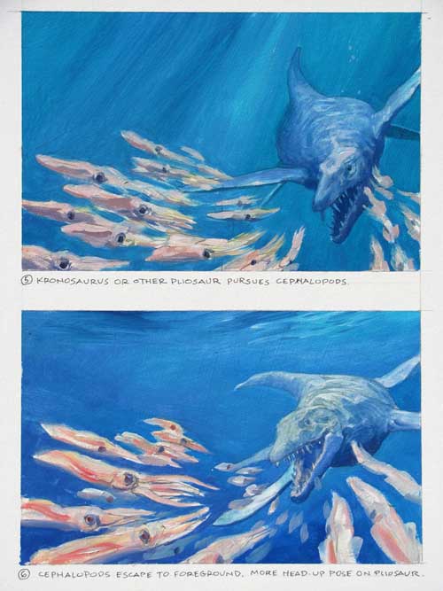
In the October issue of Ranger Rick, an article on ancient sea monsters starts off with a giant pliosaur swimming right toward us.
Here was the first sketch for it, drawn in water-soluble colored pencils. The big sea creature is chasing down a bunch of squid-like cephalopods, who are scattering in the foreground.


Before going to the finished painting, I did two small oil studies to give the art director some latitude for layout. But even though I got the green light to go to finish, I wasn’t feeling excited enough about the picture.

It wasn’t the design or the color that bothered me. The problem was that I didn’t care enough about the situation, because it’s hard to identify with invertebrates.

The solution was to show the big predator chasing a pair of sea turtles instead. We can feel for sea turtles, and we know from the fossil record that pliosaurs ate them. Framing the scene with big coral stands instead of open blue water also helped the drama.

The take-away point is that design alone isn’t enough (at least for me) to drive a picture. The story is just as important. If anything, the story should drive the design. And sometimes it takes sketch after sketch to nail down the story.
-------
Previous post on the Tylosaur, Part 1 and Part 2
Ranger Rick magazine

Thứ Hai, 25 tháng 10, 2010

Grafitti


Master graphic designer Leslie Cabarga regards graffiti writers as the “scribes of our day” and says: “I see graffiti as symptomatic of a culture that, at the leadership level, has little use for art or artists and relegates those of us with the most meager means to virtual outlaw status.”

from Cabarga's book: Logo, Font, and Lettering Bible.

Dinosaurs Invade Millburn

I spent last Friday with a high school art class in Millburn, New Jersey. We did a 4-hour workshop called DINOSAURS INVADE MILLBURN.

Each student had prepared a drawing of a street scene. Then they chose one of the scale dinosaur models that I brought along (There was also a flying monkey and a Bantha). They added the creatures to their scenes, keeping the perspective and lighting consistent.


It was a challenge, but the results were fabulous, a tribute to the students’ diligence and to the brilliant preparation of AP studio art teacher Kathleen Harte Gilsenan.

Chủ Nhật, 24 tháng 10, 2010

True to Nature


A new book about American landscape painter William Trost Richards describes the artist’s tribulations while painting the sea from life. Richards says:

“I watch and watch it, try to disentangle its push and leap and recoil, make myself ready to catch the tricks of the big breakers and am always startled out of my self possession by the thunder and the rush, jump backward up the loose shingle of the beach, sure this time that I will be washed away, get soaked with spray, and am ashamed that I had missed getting the real drawing of such a splendid one, and this happens twenty times an hour and I have never got used to it.”


The book was produced by the Cantor Arts Center of Stanford University in California, based on the sizable collection of WTR’s studies inherited by his youngest son in 1905 and donated to the museum in 1992.

The 9.5 x 11-inch book has over 204 pages, with 250 color reproductions documenting the entire collection at Stanford. It includes his Ruskin-influenced early pencil studies of plants, his Adirondack landscapes, and his seascape studies in gouache and oil. Trost Richards was the king of gouache landscape, often working on toned paper to capture transitory atmospheric and aquatic effects. 

The emphasis is on his small plein-air studies, which rival those of Frederic Church, Peder Monsted and Ivan Shishkin for impeccably accurate observation. Because Richards worked in this mode well after it was fashionable (he called  himself a “fogy”), he is not as well known as he deserves to be.  


---------
William Trost Richards—True to Nature: Drawings, Watercolors, and Oil Sketches at Stanford University, by Carole M. Osborne.
Cantor Arts Center’s recent exhibit ended September 26.
Previous GJ posts on Trost Richards: "Outer Limits of the Pencil," "Trost Richards Watercolor," "Called Away,"
Thanks, Margaret!

Thứ Bảy, 23 tháng 10, 2010

Epoch Times Interview

Two days ago, the international magazine Epoch Times published an in-depth interview. You can read it in German at this link to the online edition, or in English in the blog post below. The print edition will be forthcoming in November.

EPOCH TIMES: During your career you have been working in such different fields as book cover illustration, on animated films like Frank Frazetta/Ralph Bakshi’s “Fire and Ice,” you celebrated the outstanding success of  your Dinotopia books, which also have been turned into a TV series, and you give lectures for creative professionals (e.g. at DreamWorks Animation SKG and Lucasfilm, Ltd).

What in your perspective has changed within the field of visual art in general and for the artists and the requirements on them compared to 20/25 years ago?

JAMES GURNEY: The most obvious change in the last two decades is the emergence of digital tools, both in illustration and in filmmaking. Although I work in traditional oil paints, I find this new technology very interesting, particularly the breakthroughs in 3D modeling, lighting, and animation, because it has brought about a renaissance of new understanding of the visual world. It has brought artists together with physicists and mathematicians to better understand such things as subsurface scattering, caustics, occlusion shadows, and particle behavior. All of these new insights have influenced me, even though I work entirely in traditional media.

But I think your question touches on another, and perhaps less obvious change. Emerging forms of digital distribution offer artists new ways to market and promote their work.

These tools have given artists a lot of choices for how to use their talents. If they enjoy working collaboratively on a large enterprise like a film or a video game, there are huge opportunities. The term “concept artist“ didn’t exist when I was in art school. But artists can also work alone to write, illustrate, and design their own illustrated stories, graphic novels, or even animated films, and connect with the readers before the works are published.

ET: Considering platforms like “Deviant Art“ or “Conceptart.org,” in which artists seem to produce outstanding artwork en masse every day, one provokingly may ask: is there still a demand for illustration/imaginative artwork and what does this mean for the individual artist of today?

JG: I can’t say too much about those forums simply because I don’t have enough time online to be able to explore them, but I realize they’re a rich resource for both emerging artists and professionals.

People are hungrier than ever for images from the imagination. Imaginative artwork is healthier than ever today. The most successful exhibit in recent years at the American Society of Illustrators was the Spectrum exhibition. Most young people have grown up loving comics, games, science fiction, and fantasy, so it’s not going away soon.

In your first instructional book on illustration, “Imaginative Realism – How to Paint What Doesn’t Exist” you give an extensive overview, drawing from the treasure trove of the Golden Age of illustrators as well as providing a generous insight into your personal methods and experiences, on how to create imaginative artwork in an encompassing way that I didn’t find in such form yet – will there be further publications after “Color and Light?” What was your initial starting point/motivation to go for a “how to”-book?

Yes, there will be more books after Color and Light, including another art-instruction book, sketchbooks, and new illustrated fantasies along the lines of Dinotopia. I’m also keenly interested in video, e-book, and app formats, so I will find at least a little bit of time on the side to develop those ideas.

To answer your second question, like a lot of artists in my generation, I found that art school didn’t answer all the questions that were burning in my mind. I was hungry for certain chunks of information, and I could never find it, so I wrote the books to answer all those questions.

To research those books, I drew not only from my own direct experience, but also on that of the older mentors I encountered, such as the classic illustrator Tom Lovell. I also researched out-of-print art instruction books from 50 and 100 years ago, which was like a window into the distant past.

Imaginative Realism reached within the last six months the #1 position on Amazon.com in the categories of both art instruction and painting, Color and Light, not released yet, is already on #3, only through pre-orders! How do you explain this success and was it surprising for you?

Completely unexpected, both for me and the publisher! There are so many good books on art instruction out there, especially about drawing the figure, or painting a landscape, or rendering a still life. I didn’t want to repeat what has already been said. But as I looked at the available books, I realized there were gaps, and those pieces of missing information were what I wanted to offer. Surprisingly few books systematically explored the question of making a realistic picture of a subject from fantasy or history. That was the subject of my first book.

Concerning “Color and Light” – one might say the two most fundamental themes of art. I was skimming through the archive of your blog “Gurney Journey“ and found as well a lot of theoretical knowledge as practical examples – what can we expect of this book? Can you give us a brief overview? What are it’s essentials/what was most important for you ?

As I assembled the first volume, Imaginative Realism, I realized that the information on color and light was so extensive that I decided it required a second volume.

I was interested in reaching four groups of readers:
 
1. Artists of all media interested in a traditional realist approach.
2. Fantasy and science fiction artists, illustrators, and concept artists.
2. Non-artists who are curious about the workings of the visual world.
3. Collectors and and fans of my artwork, making sure to introduce all new artwork compared to what we saw in the last book.

Here’s what the book contains: The book begins with a survey of historic masters who used color and light in interesting ways. It then examines the various sources of light, and we look at how light creates the illusion of three-dimensional form. The middle chapters cover the basic properties of color as well as an introduction to paint and pigments.

Then I present the method I use for color planning called gamut mapping. The later chapters of the book deal with specific challenges that we face when we wish to portray surfaces like hair and foliage, together with detailed information about the infinitely varied phenomena of atmospheric effects. The book ends with a glossary, a pigment index, and a bibliography.

The book does not contain recipes for mixing colors or step-by-step painting procedures. It is not overly technical, but it deals authoritatively with the topic. I also spared the reader some of the extremely technical discussions that are hard to follow unless you’re a physicist. Instead I wanted to keep the text brief enough so the artwork could be reproduced large. And I wanted to offer practical observations that painters can really use. I have already heard from art teachers that it will used as a textbook in art schools and I hope it will be a standard studio reference for many kinds of artists.

Of what I got from your blog, stronger than in “Imaginative Realism,” you seem to focus in your new book on plein-air studies; in “Imaginative Realism“ you promote as well a classic approach to using plein-air studies, charcoal studies from life models as well as from nature whilst the modern digital painter oftentimes is used to working mainly with photo references he loads into his painting software. Why are studies from life so important? What is the difference to working with photo references and is this approach achievable within today’s fast-moving industry (be it book publishing/editorial artwork or conceptual design for the film- and game industry)?

The best way to answer that question is to show you a page from the book which shows the comparison of photographed and observed reality.


Working from imagination and from observation are indispensible to each other. I couldn’t paint from my imagination for very long without needing to go outdoors, and I couldn’t paint from observation exclusively. And yes, it’s achievable to work from life in this fast-moving world. A charcoal study from the model only takes fifteen minutes. But I also love spending three hours or more doing a careful oil study from observation.

Contrary to many modern art schools you do not promote to go for an individual/“personal“ style. Can you explain why?

You’re right. I think it’s a mistake to dwell on developing a personal style, especially for a student, because sometimes the style gets in the way of really seeing. Also, any style eventually becomes tired and stale, but truth to nature is timeless. In my view, students especially, but also working professionals, should keep studying the world around them with close observation. It’s natural and good for young artists to model their pictures after those of other artists as a path to mastery. But I prefer my heroes to be dead, and I’ve always tried to study many different ones, not just one.

In the afterword of IR you quote American painter Harvey Dunn, who said: “The only thing that’s true about anything is the spirit of it,” concluding the book by saying: “Art that lives in the memory and stands the test of time mixes earthiness with mystery, containing both a fistful of clay and a feather from an angel’s wing.” What in your point of view is essential for good art in general and is there something you can share to young up-striving artists?

I can’t speak for what is “good art“ because I love many different kinds of art which are based on different starting premises. But I have always been interested in a painting where the surface seems to disappear and I feel I can live inside the scene I’m painting. There’s a Latin quote that I have wood-burned onto my mahl stick. It says: “Ars est celare artem.” I picked it up from an artist named James Perry Wilson, who painted the illusionistic diorama backdrops in the American Museum of Natural History. It translates: “True art is the concealment of artifice.” It’s easy to make a painting look like paint, but it’s much harder to make a painting that pulls in viewers so completely that they feel the heat of sun on their neck and the sand in their shoes.

Art is more than illusionism, of course. What really matters to me in the end is to what extent a given work connects the visible world with the world of dreams and emotions. Many different modes of art can achieve that goal, but what excites me is art that does so by being sensitive both to the visual world around us, and the sea of mystery inside us. The inner eye and the outer eye inspire each other.

Interview by Christian Schlierkamp
--------
Epoch Times
Color and Light
Imaginative Realism
ConceptArt
Deviant Art
Spectrum News (Review of Color & Light)
James Perry Wilson
Previous GJ posts on Tom Lovell, Using Photo Reference

Thứ Sáu, 22 tháng 10, 2010

Cotton-Gesso Maquettes

Artist Dragan Bibin has developed an interesting method to create reference maquettes using gesso-saturated cotton.


He begins with an armature made from aluminum wire and tin foil, wrapped in masking tape.   
This framework is coated with acrylic gesso. Then bits of dry cotton are applied to the wet surface and shaped with a small brush, adding more acrylic gesso until the cotton is saturated enough to hold the desired shape.


All the shaping is done with a small brush. The forms are built by adding layers of patches of the saturated cotton. This method is actually very fast, because you don’t have to wait for the surface to dry to build upon it.
   
The resulting maquette is inexpensive, lightweight, airy, very tough, and durable, since the acrylic polymers are fairly elastic. Once it is fully dry, it can later be sanded and painted with acrylic paints.     

Thanks, Dragan!
Dragan's Blog with more pictures
Dragan's Website

Thứ Năm, 21 tháng 10, 2010

Spotted Cats

Discovery News announced yesterday that the spotted patterns on woodland species of wild cats are tied to the patterns of dappled light in their forest environments.


Cats in open ranges, such as lions, tend to have plain coloration. Tiger stripes, according to the University of Bristol researcher William Allen, are still something of a mystery.

Full article by Jennifer Viegas 
Previous GurneyJourney post on Dappled Light 
Thanks, Libby!

Mostra Gurney

Per allestimento e per atmosfere, la mostra che maggiormente colpisce è quella dedicata a James Gurney, 'padre' di Dinotopia, diventato in pochi anni un classico per ragazzi, capace di far respirare ai giovani lettori l'atmosfera di un continente perduto.


Tradotto in 18 lingue, la saga fantastica di Dinotopia è famosa in più di trenta Paesi, ma ancora, tra le lingue in cui è disponibile, manca proprio l'italiano, nonostante in Italia questo autore abbia il suo seguito tra gli appassionati di fantasy e di illustrazione fantasy.  (di più)

English:
One exhibit in the Lucca show is dedicated to the work of James Gurney, 'father' of Dinotopia, which has become a classic for children, inspiring young readers with the mood and atmosphere of a lost continent.  The fantastic saga of Dinotopia has been translated into 18 languages and distributed in more than thirty countries, but unfortunately an Italian edition is not currently available.  (Read the rest of the article)

Lo Schermo Online
Lucca Comics and Games

Thứ Tư, 20 tháng 10, 2010

Dorne’s Drapery

This drawing by Al Dorne appears in the Famous Artists Course, accompanied by the following caption: “A fine example of the stresses and tensions which show up in clothing when the figure assumes certain positions.”


“Note the way the overalls are bunched into deep half-lock folds in the back of the knee and at the hip joint. On the buttocks, the top of the thigh and the knee, the material stretches tightly over the underlying forms.”

I would add a couple more observations. The folds radiate from points of tension (shoulder, butt, knee, and elbow). Since most modern, fitted garments are constructed to be relatively wrinkle-free for a standing figure, a seated or kneeling figure creates areas of compression where the material has no choice but bunch up.


Folds also radiate from the seams where the arms meet the shoulders on both of these figures. Those folds often don’t continue across the seam because of the contrasts in thickness and fabric grain direction from one side of the seam to another.

All of these effects are softened in knit fabrics (such as T-shirts), which stretch in all directions, as opposed to woven fabrics, which stretch only on the bias.
-------
Famous Artist's School on Wikipedia

Masterminds of Megamind

This photo panorama stitches together the north campus (PDI DreamWorks) and the south campus (DreamWorks Animation SKG) of the DreamWorks concept art team, the masterminds behind Megamind and many other films. (Click to enlarge.)


In the left picture, I’m holding an advance copy of “Moonshine: DreamWorks Artists After Dark,” which showcases the private artwork of each of the concept artists.

The book has over 150 color illustrations by 47 artists. Images include wonderful characters, real and imagined creatures, moody cityscapes, and dreamlike wild lands. The artists at DreamWorks are equally at home in many different media: ink, charcoal, pastel, watercolor, acrylic, oil, and digital. Most switch comfortably back and forth between digital and traditional.

Paul Lasaine (far right) recently did an in-house demo where he painted the same image in acrylic and Photoshop, and got almost identical results.
 -----
Moonshine: DreamWorks Artists After Dark
The Art of Megamind
Paul Lasaine's blog post "Traditional vs. Digital"
Previously on GJ: DreamWorks Dream Team

Thứ Ba, 19 tháng 10, 2010

Sideshow Color Photo

The Denver Post published a portfolio of color photos of America taken between 1939 and 1943 when color photos were rare.
 -----
Denver Post--Captured America
Thanks Ladida


Weighing In

At Philippe The Original restaurant in Los Angeles, you can weigh yourself on a scale for 25 cents. According to the restaurant, the scale is the same one used by Norman Rockwell for his 1958 painting “Weighing In (The Jockey).”


The original painting, owned by the New Britain Museum in Connecticut, shows jockey Eddie Arcaro standing on the scale under the watchful eye of the racing steward.
------
Philippe The Original
New Britain Museum
Eddie Arcaro on Wikipedia

Thứ Hai, 18 tháng 10, 2010

Jeffrey Watts

Jeffrey Watts is the founder of the Watts Atelier near San Diego, California, which he runs with the help of his wife Krista. I gave three digital presentations to a sold-out house there last Friday, and then did a 25-minute portrait sketch demo using water-soluble colored pencils.


The atelier is a large room in a professional building, lined with skeletons, drawing casts, copies of Sargent and Fechin, and figure and landscape paintings by Watts and other instructors.


Watts started the atelier in 1992 when he was just 22 years old, and now has about 250 students with a faculty of 10 instructors. His approach combines rigorously accurate drawing with a painterly handling that he describes as “controlled chaos.” He brings to his art the same the discipline that he learned earlier in his life when he was training to be a professional cyclist.

According to a September, 2006 article in American Artist, his students begin with a thorough experience of drawing, then progress to a grisaille palette, and then to a limited “Zorn” palette of titanium white, ivory black, cadmium red light, and yellow ochre before graduating to a full palette.


In this video sample, he shows his own approach to painting a “gesture portrait,” and explains some of his suggested palettes.
-----------
Jeffrey Watts.com
Watts Atelier

Chủ Nhật, 17 tháng 10, 2010

Cool Signatures

Who had the best signature (never mind the artwork)? Please vote in the poll at left.
-----
Addendum: The winner is Frazetta, with 312, followed by Leyendecker with 129, and Norman Rockwell with 66.

Cultural Memory

Yesterday an exhibit of of over 40 of my paintings opened at the Palazzo Ducale in Lucca, Italy. One of the paintings on display shows the Kushite King Piye in 724 BCE, painted for National Geographic in 1990.


A few years ago, I brought that same painting out of my house to show a delivery man who had come to my house to pick up some other paintings.

The man told me he was from Sudan, the region where archaeologists have found remnants of the Kushite culture. I asked him if he had ever heard of Piye (or Piankhe, as he’s also known), or of the Kushite civilization, which was once powerful enough to conquer even the Nile valley to the north. The man just smiled and shrugged. He had never heard of any of it.

I was reminded of the stories of modern Khmer people living among the ruins of Angkor Empire, not knowing their ancestors had built it.

How easy it is to forget our own cultural heritage. It can happen from a period of willful cultural obliteration by a group in power, from a failure of education, or simply from the distraction of other things in the present field of view.
-----------
GJ post all about that painting.
The Italian exhibition is sponsored by Lucca Comics and Games.

Thứ Bảy, 16 tháng 10, 2010

How to Criticize

Artists rarely create in a vacuum. Even if you paint alone, you’ve got to consider the feedback of art directors, patrons, or galleries. If you’re a student, you have to present your work to teachers and to your peers for critiques, and sometimes you’re called upon to criticize others’ artwork.


When you work for an entertainment company, such as an animation or game company, your efforts are part of a larger shared vision. Developing the diplomatic skills both to give and receive constructive criticism becomes especially important.

This subject has come up during our recent visits to entertainment companies. Angela Lepito, manager of art development and training at DreamWorks, told me that entry-level artists are assigned a mentor to help them learn the company etiquette. It can be vital to the career of a concept artist to know when it’s appropriate to speak up in meetings—and when it’s best to keep silent and listen.

Kevin Bjorke of Trion World Network, a massive multiplayer online game company in Redwood City, told me about how Phil Perkis teaches critiquing to his photo classes. In a nutshell, “It’s about the work and not about the person who made the work.”

Perkis lays out the following rules for in-class criticism, which are strictly followed:

1. No rudeness
2. No competition
3. No telling the artist what the work means about them (a critique is not psychotherapy)
4. The class chooses what work will be talked about (Students should feel free to ask that their work be dealt with because they need feedback). No need to address every work in every class.
Here's the main principle:

“The person whose work is being addressed can answer factual questions in the beginning, i.e., where was the picture made, what film, lens, etc. They can say nothing about intention, content, or other meaning. At this time, the rest of the group can say anything they like about the work, be it craft, aesthetics, politics, art history, et al. The are free to say anything. They can report associations in their minds, dreams and fantasies as long as it's about the work and not about the person who made the work.

“Something very interesting starts to take place if this is done with openness and intelligence; the student is getting real information about what their work is communicating to a group of people who are being as honest and caring as possible. This information is for the use of the student and they can do anything they want with it. The work never has to be defended, justified, or explained. At this point, if a student wants to talk about the work just discussed, they can do so as much as they would like, and a long back and forth discussion can take place.

“The role of the teacher in this process is to moderate, and to be a participant along with everyone else.

“The sole purpose of the critique is for students to gain insight about their work and have information that will help them proceed to the next stage of development. As a group works together from week to week, a level of trust and understanding can develop so that people are more willing to take chances both in the discussion, but more importantly, in their work. Then you've really done something worthwhile.
“It is vitally important for the group, and especially the teacher, to make clear the difference between fact (a smaller aperture gives more depth of field) and opinion (this picture has a violent edge). Making this difference clear allows the discussion to range much bigger.”
------
The Perkins method of critiquing
DreamWorks Animation
Trion Worlds
Photo is of Bill Eckert, Gary Geraths and me at Otis College of Art and Design
Thanks, Angela and Kevin!

Thứ Sáu, 15 tháng 10, 2010

Hazy Light

I have an almost insane love of the hazy light of LA. Clear skies are pleasant, but when I'm painting, the more smog the better.

I was sitting outside a restaurant in Eagle Rock, looking toward a hot, low sun. The palm trees and utility poles were pale and milky silhouettes. This was painted in watercolor in a 5x8-inch Moleskine sketchbook.
 -----
Let me take this moment to thank everyone for hosting my presentations so far at the studios and art schools: Trion, SJSU, A of A, CCA, TAD, Otis, Atelier Marchant, LCAD, DreamWorks and Carlsbad Library! It's been a blast meeting you all and seeing your amazing artwork. My head is spinning! Today we go to the Watts Atelier in Encinitas (which is sold out), and then across the desert to AI Phoenix!

Thứ Năm, 14 tháng 10, 2010

Cafe Culture

Jeanette and I have been mooching Wi-Fi from coffee shops like everyone else does.
She did this sketch of a cafe patron using a Micron brush pen.


I guess we’re part of an alarming trend. In one Starbucks, we noticed 14 patrons. Eleven of them were busy with laptops, two were interested in hand-held devices, and one was a kid playing quietly with an empty coffee cup.

Nobody spoke, except to say, “Do you mind if I plug this in?”