Thứ Tư, 17 tháng 11, 2010

Illustration's Fall Issue

The new Illustration magazine has three juicy articles on mid-century American illustration.


The first explores the work and career of J. Frederick Smith (1917-2006), who painted and photographed glamorous women. His first-hand account describes his fast-paced lifestyle, and the challenges in getting the right models for the photo shoots. This article alone has 70 reproductions, including excellent scans original art, photo reference, tearsheets, and behind-the scenes photos.

Another article chronicles the career of Clark Hulings, one of the great illustrators of paperbacks and album covers in the 1950s and ‘60s, before his love of travel led him to a career (that he’s still pursuing) painting gallery canvases of picturesque destinations.

The coverage rounds out with the story of the life of John Fleming Gould, who painted pulp art and car renderings. All three articles benefit from the first-hand voice of the artists themselves.

The magazine announces two other exciting developments. First is the imminent arrival of “Masters of American Illustration: 41 Illustrators and How They Worked,” by veteran illustration historian Fred Taraba and publisher Dan Zimmer. This promises to be a worthy successor to the classic book “Forty Illustrators and How They Worked.”

The other is the announcement of “The Illustration Gallery,” part of the Illustration catalog, a new place to buy and sell original works of illustration art.
--------
Illustration Magazine
Taraba Illustration Art
Clark Hulings.com (Image above: "Ville Franche")
J. Frederick Smith on AskArt 
40 Illustrators and How they Work (The 1940s classic from Amazon.com)
The Illustration Gallery contact info.

Thứ Ba, 16 tháng 11, 2010

Sickle Cell Stamp, Part 2

This is Part 2 of the making of the Sickle Cell stamp for the U.S. Post Office. Part 1 is here.

Normally I use friends and neighbors as models, but I didn’t know anyone who had the right look for a young African American woman or a baby of the right age. Through a modeling agency, I located excellent models for both characters. Unfortunately, they were no relation to each other and had never met.


That meant the modeling session might be risky because babies of that age often are afraid to be held by strangers. And in this case, the woman posing as the mother was a young dancer who didn’t yet have children of her own. If the baby started crying, the session would be a disaster. To be safe, I scheduled the modeling sessions back to back.

The “mother” posed first, holding a stuffed bear as a stand-in for the baby. Then I photographed the baby being held by a favorite aunt. Finally, we put the baby in the model’s arms. After a moment of wide-eyed consternation, the baby broke into a smile, and the two got along wonderfully.


The resulting photos provided a basis for the final oil painting. I had to change the little girl into a boy, and I changed the pose so that the mother was leaning back more. I also softened the light source to remove the harsh shadows.


Even a photo reference shot from professional models should be regarded as just a starting point, and you should feel free to change anything to make the final result express your initial vision for the pose.
------------

Sickle Cell Conference at the NIH Campus in Bethesda, MD, Nov. 16 and 17
Wikipedia on Sickle Cell Disease
Sickle Cell Stamp, Part 1
Previously on GurneyJourney: Tips on using photo reference.
-----------

Thứ Hai, 15 tháng 11, 2010

Sickle Cell Stamp, Part 1

Tomorrow, the National Institute of Health will host a symposium discussing sickle cell disease. On display at the gathering will be the original oil painting I produced for the 2004 U.S. Postal Service stamp commemorating the disease.

Today and tomorrow I’ll tell the story of the making of that stamp.

Over the years the U.S. Postal Service has released stamps designed to help raise awareness about health issues. When the Stamp Committee decided on a stamp recognizing sickle cell disease and asked me to design it, I was honored to take on the challenge.

I knew it would not be easy to visualize an incurable hereditary blood disease in a way that would be inviting and interesting. The image that comes readily to mind when people think of sickle cell disease is a microscope slide showing the elongated red blood cells alongside normal round cells.


The credit for the design solution belongs to veteran art director Howard Paine, who suggested portraying the scene in universal human terms. Because the disease or the trait is passed down from parent to child, he proposed showing a parent’s love for her baby. Why not show a mother and a child interacting with love and affection? The message then becomes a positive one, reminding at-risk parents to test early to find out whether they carry the gene.

I sketched up several different design ideas in color. The most successful version shows the mother holding up her year-old child in profile and giving him a kiss. The committee approved the design (sans microscope slide) and gave me the go-ahead.
--------
In part 2, I describe how I went from the roughs to the finished art.
-------
Sickle Cell Conference at the NIH Campus in Bethesda, MD, Nov. 16 and 17
Wikipedia on Sickle Cell Disease

Chủ Nhật, 14 tháng 11, 2010

Matania at Work

Archival newsreel film footage brings to life the working process of Italian/British historical illustrator Fortunino Matania.


You can click the image above to link over and see the film.

It shows Matania directing costumed models, who pose as he draws them directly into the finished illustration. He adds the missing elements, such as settings and horses, from his imagination.


Ever the showman, Matania puffs from his cigarette as he draws, jumping up from his chair to joke around with the model. The film ends with him working away, surrounded by a a Bohemian throng, with one of them strumming a guitar.


(Link to British Pathe, where you can watch a small-scale preview or pay to get a full-rez download)
Previously: Matania's Models and Props
Matania: Without a Net
Image: "Goodbye Old Pal" (Man comforts dying horse)
Thanks, Daniel 

Thứ Bảy, 13 tháng 11, 2010

The Spell of the Cell

Cell phone users hold predictable poses for relatively long periods. They’re oblivious to the world around them, making them good sketching subjects.


This man in France was talking energetically while gesturing with the non-phone hand. His right hand held a slip of paper and a pen.

The fact that people gesture while talking on cell phones suggests that hand movements benefit the speaker more than the hearer.


When men check messages, they usually stand with their feet wide apart and their pelvis forward. They duck their chin to their chest and hold the cellphone against the base of their sternums.


Children melt into their chairs. They totally relax their legs and feet. The outer world disappears. They fall into a reverie. Their minds link with the machine.

(Note: We’re home now in New York. Many of the upcoming posts will be from places we’ve been over the last two months--western USA and Europe. I’m just catching up from a lot of material generated over the last month of touring. I’ll try to keep the Facebook page updated with what we’re doing and what’s coming up.)
------

Thứ Sáu, 12 tháng 11, 2010

The Angel Academy of Art

The three great domes of Florence were shining in the morning light yesterday.


On the left of the picture is Jay Blums and on the right is Martinho Isidro Correia. Both instructors are originally from Canada. We're standing in the Angel Academy of Art, one of the world’s leading centers for academic training.


The school was founded by Michael John Angel, known as “Il Maestro” by his students. Mr. Angel was a student of portrait painter and muralist Pietro Annigoni (1910-1988).


The school consists of two buildings near the center of Florence, where 60 students from 29 countries follow a focused curriculum. The method is based on traditional realistic painting methods that Mr. Angel has painstakingly researched.

Students begin by carefully copying plates from Charles Bargue’s 19th-century drawing course. Then they proceed to portraying the plaster cast under artificial light, using "sight-size" procedures, first in charcoal, and then in oil.

They graduate to working from still life subjects and to drawing and painting the living figure.

The entire regimen has taken as little as two years for a few very precocious students. More typically it takes three or four years. A single oil or charcoal can take several months. People move to succeeding steps in the curriculum depending purely on their readiness.
-------------
Angel Academy of Art
Michael John Angel
Cast drawing at left is by Dorian Iten
Charles Bargue Painting Course (Book from Amazon)
Pietro Annigoni on Wikipedia
Wikipedia on the Atelier Method & Sight-Size Drawing
Related GurneyJourney posts:
    Academy of Realist Art, Toronto
    Grand Central Academy, New York
   En Loge (Prix de Rome) Competition

Thứ Tư, 10 tháng 11, 2010

The Marais

Around the city of Bourges, France, is a vast system of marshes and canals called the Marais. The low land has been reclaimed as allotments for gardeners, who grow swiss chard and lettuce.


Footpaths follow the canals, punctuated with pollarded willows . Pensioners walk their dogs or ride along on bicycles, greeting each other as they pass. The air is hazy, and fragrant with the smell of burning leaves.

Last Judgment

One of the stained-glass windows of the cathedral of Bourges shows scenes the Last Judgment.


Here, the souls are thrown into the mouth of the Leviathan. The scene is conjured with all the vividness of the 13th century imagination.

Guest-blogger Jeanette

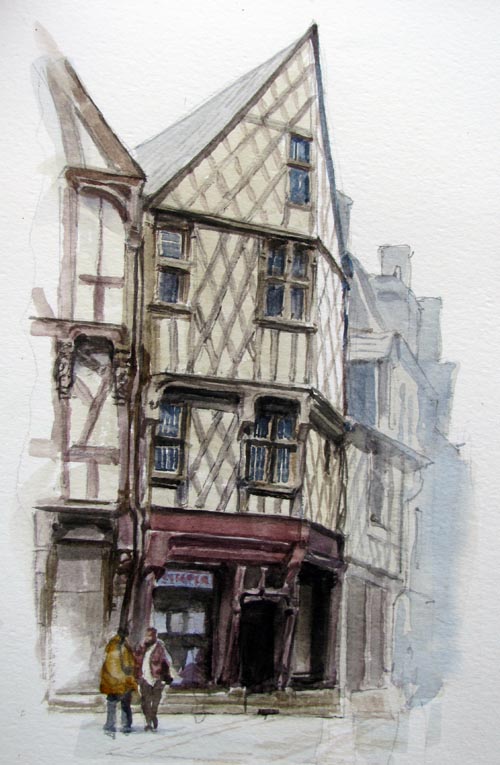
This sketch was done in ballpoint pen with watercolor wash. I sat next to Jim, and my picture begins just to the left of where his sketch ends. Trying to get the half-timbering (pan-de-bois) correct was insanely time-consuming.

As we sat there on our folding stools, people from Bourges kept walking by us, saying encouraging things in French. At least I assume it was encouraging from their facial expressions, as I don’t speak much French.

It’s amazing how Jim and I can sketch the same subject at the same time and come up with entirely different results. Almost invariably, mine is breezy and cheerful, and Jim’s is carefully drawn, with moody lighting. I see everything in line, Jim sees form and light first.

Thứ Ba, 9 tháng 11, 2010

Tao of Painting People


Don’t paint a figure; Paint a person.
Don’t paint a head; Paint an individual.
Be accurate, but see beyond the surface.
Beware of pictures that are correct but lifeless.


The face is the window to the soul.
All of humanity’s greatness and frailty can be found in a single pair of eyes.


---------
Portraits by Peder Krøyer (1851-1909). Thanks to Tim Adkins for the close-up.
Krøyer on Wikipedia

Map Crunch


What do other countries in the world really look like? Standard tourist photos don’t give you genuine slices of life.


The website “MapCrunch.com” allows you to view random images from the vast Google street view archives. You can select from 18 different countries around the world and choose whether you want country roads or not. The examples above are from Spain, Hong Kong, Mexico, and Missouri (USA).

This would be a fun motif-generator for the tiny landscape painting exercise in yesterday’s post. Press the button and paint the scene in 10 minutes or less!

MapCrunch.com
GurneyJourney: Tiny Landscapes
Thanks, Toby Neve

Unveiling at the Jules Verne Museum

Yesterday I had the privilege of attending the unveiling of two paintings that are now part of the permanent collection at the Jules Verne Museum in Nantes, France.


Upper left: The paintings on the wall of the museum near the entrance; the dedication ceremony yesterday; the Jules Verne medal presented to me by Jean-Louis Jossic, the cultural minister of Nantes; and standing near the fountain in the Place Royale, where the painting is set.

According to the article in today's Ouest-France:

"Le musée acquiert deux illustrations de l'auteur de Dinotopia: l'une, Décollage nocturne, a servi pour l'affice du festival des Utopiales 2009, tandis qu'une autre représenet le musée installé sur son rocher."
------
Ouest France: "Deux oeuvres de James Gurney au musée Jules Verne"
Musée Jules Verne
Utopiales Festival 2009

Previous GJ Posts:
Floating Jules Verne Museum
Utopiales Painting, Part 7: Final Painting
Part 6: Washin
Part 5: Pencil Drawing
Part 4: Lighting
Part 3: Maquette
Part 2: Researching Insect Flight
Part 1: Initial Sketches

Thứ Hai, 8 tháng 11, 2010

Muddy Colors Blog

The new blog called "Muddy Colors" brings together an all-star line-up of illustrators and designers with daily insights into the thinking behind the art of contemporary fantastic art.

In the last five posts:
Dan Dos Santos reflects on digital versus traditional and violence in covers.
Arnie Fenner describes how movie posters and paperback covers got him fired up about art.
Greg Manchess shows how he painted a cover with clockwork fairies.
Jon Foster explains how he uses thumbnails to find the best image.
Dan Dos Santos shows the various sketches on a job and the thinking behind them.

Tiny Landscape Nuts and Bolts

This is an answer to the questions from Petr and Vicki from the previous post (by the way, I appreciate all the kind comments, and the haiku, Dan!)


Anyway, the tiny landscapes were done with a mixture of watercolor and water-soluble colored pencils. I usually start with a quick lay-in using a brown Caran-d'Ache pencil. The watercolor is a Schmincke half-pan set.

Then I painted the sky with a flat watercolor travel brush. The brush is the gold metallic thing just to the right of the rows of paints. It divides into two pieces, with the handle acting as a cover and protector for the brush tip when stored. I also used a Niji water brush for softening some areas.

Then I painted the other big shapes of the landscape with watercolor, and added detail and foliage texture with the colored pencil. The notes are written with the blue Waterman Phileas fountain pen (filled with brown ink) that's just visible above the Moleskine watercolor book.

The rag is a scrap of cotton flannel, and the cup is a Nalgene plastic jar.

Sorry, the Mac iBox (upper right) is a prototype only, and is not for sale.
----------
Previously on GJ: How to refill a fountain pen.

Tiny Landscapes


Traveling often gives you time in 15 minute intervals. This morning, for example, I found myself on the train platform in Bourges from 7:25 until 7:39 AM.


But that’s enough time for a painting the size of a postage stamp. I got out my Moleskine watercolor book and the other little tools that I keep in the side pouch of the computer case.


There’s the painting on the far right of the second row (click to enlarge). A few minutes later the TGV train passed farms near Vierzon, where the lights of the houses still glowed. The landscapes—and the weather—changed moment to moment.

This is a really fun way to work if you want to tackle new subjects, or to try a new medium, or to explore new compositional ideas.

Chủ Nhật, 7 tháng 11, 2010

Bourges Watercolor

We set up our folding stools in the middle of the old section of Bourges, France, yesterday, looking toward the half-timbered houses that were built soon after the great fire of 1487.

I spent the first hour working out the pencil drawing on the 6x8 inch Moleskine watercolor book. I then laid very light washes in gray and brown, leaving the white of the paper only in the far, upper plane of the central building.

Then, starting with the very dark doorway, I painted the structure area-by-area. The whole painting was done with a folding travel brush, a 1/4 inch flat. The flat, chisel shape can be used edge-on for a fine line, or full-width for wider shapes, such as the reddish brown sill piece at the top of the first floor.

In the final painting I lightened the further buildings on the right side, both to vignette the subject and to give a sense of fog.

Thứ Bảy, 6 tháng 11, 2010

French Bulldog

This little fellow was a passenger on the train from Nantes to Bourges yesterday.

 
His owner had a little blue padded bed for him and encouraged him to sleep, but he preferred to glance out the window. When I made bird-whistle noises, he looked over at me so I could do his portrait.

Half-Timber Message


Can you find the name of an American university hidden in the half-timbering of this unretouched photo, taken in Bourges, France?

Thứ Sáu, 5 tháng 11, 2010

Color and Light Flip Through

Thanks to BoingBoing for picking up my scoop about the new iBox!

And thanks to Spectrum for the nice video flip-through and review of Color and Light: A Guide for the Realist Painter.


Spectrum writes:
"Based on Jim's enviably popular blog, this book slices though the confusing and often contradictory dogma about color with laser-like precision and backs it all up with some astonishing examples of Gurney's own paintings as well as with a welcome (if brief) survey of underappreciated masters who perfected how light reveals form and content. Color and Light is another gotta-have-it book for anyone who wants to paint, anyone who wants to improve their painting skills, or anyone who simply want a better understanding of the creative process."

Color and Light: A Guide for the Realist Painter (Signed from Dinotopia Store)
Color and Light from Amazon
Spectrum: The Best in Contemporary Fantastic Art

Thứ Năm, 4 tháng 11, 2010

The New Mac iBox


Look what someone accidentally left in a laundromat in Italy—a working prototype of Apple’s much-rumored new iBox, ahead of the official launch.

It’s a lot smaller than the MacBook Pro, and even a bit narrower than the iPad. The design of the outside is very simple, with no connection ports at all. It keeps to the same simple brushed aluminum look with rounded corners. It’s a bold step into the wireless, portable, creative suite market.


When you open up the hinged upper lid, the iBox interior is filled with 29 different graphic art tools, each of which responds to a variety of hand movements. The interfaces are fairly intuitive, with a variety of mark-making potential.

Problems: The hue range is limited. The receptive surfaces will be sold separately by third party vendors. And the the gray undo tool isn’t compatible with all the rendering devices.

Thứ Tư, 3 tháng 11, 2010

Piccoli Ritratti

Here are some little portraits of some of the amazing people we had supper with in Lucca:

1. The incomparable comic artist Massimiliano Frezzato, creator of I Custodi del Maser, 2. Terry Brooks, author of Sword of Shannara, 3. Emanuele Vietina, vice-director of Lucca Comics and Games, and 4. Steve Perrin, game designer for Dungeons and Dragons and RuneQuest.


Also: 1. Skippy, 2. Mandy, 3. Athos, and 4. Andrea. These sketches were all made with water-soluble colored pencils, and all were drawn around the supper table (except the one of Skippy, which was a workshop demo).

Lucca Comics and Games

Thứ Ba, 2 tháng 11, 2010

Exhibition at the Lucca Festival in Italy

One of the early civilizations of Dinotopia was centered in Poseidos, where machines replaced living creatures.
The ships in the harbor resembled giant fish. Flying vehicles called skimmers were fashioned after trilobites. Not a scrap of dirt or foliage remained in the island capital.

The book Dinotopia: First Flight (1999) follows the adventures of one young cadet who escaped that dystopian empire and tried to foil its plans to invade the rest of Dinotopia.

This painting will be reproduced in the upcoming book Color and Light: A Guide for the Realist Painter. It was also included in the exhibition, concluded November 1 at the Ducal Palace in Lucca, Italy.

Thứ Hai, 1 tháng 11, 2010

Finishing Lucca Demo

I painted for another two hours on the charity auction demo, here at the festival of comics and games in Lucca, Italy.


The changes are mostly corrections in the drawing: fixing the windows, and tinkering with the placement of the dinosaur’s legs.


My reference was this colored pencil sketch, and I hope to do more of these tomorrow after the rain clears.


It was a great pleasure to meet and paint next to an artist I’ve admired for many, many years, Phil Hale. He painted a whole series of images based on rubbing out of black oil paint.

Lucca Comics and Games

Chủ Nhật, 31 tháng 10, 2010

Skull Check-Out


The Laguna College of Art and Design has plastic skulls that students can check out. Happy Halloween from Lucca, Italy.

Thứ Sáu, 29 tháng 10, 2010

Lucca Demo


I'm in Lucca, Italy, at the Lucca Festival of Comics and Games. Sorry the Internet is limited where I'm staying, but here's a picture of me today, about two hours into an oil painting demo.

Thứ Năm, 28 tháng 10, 2010

Color Harmony Dials

The idea of isolating a part of the color wheel to explore the possibilities of limited color schemes was popular many decades ago. My own method borrows a great deal from Walter Sargent’s book “The Enjoyment and Use of Color” in the 1920s.

Another method, intended not only for the painter, but also for the interior designer, was published by Pedro J. Lemos around the same time.

The color designer can choose from six “color harmony dials” that can be placed over the wheel and rotated, revealing families of colors.

Lemos used a color wheel with lighter tints on the outside and darker shades on the inside. As a result, the colors visible within the dials include tints and shades, but lack any real deliberate choice of relative chroma or intermediate mixtures.

Thanks, Aaron Miller!

Thứ Tư, 27 tháng 10, 2010

Elasmosaurs

OK, one more "sea monster" painting, this time an elasmosaur, a long-necked plesiosaur.

Here's the finish first. There are some caustic effects on the back, with a few fish scattering before those long snaking necks.

I'm showing two hunting in tandem, with a surprise-attack technique of lifting the head up in murky water to grab fish from below. I had to control the values to make the colors get lighter as they go farther back in the water.

 Here are two comp sketches, each of which had qualities I liked and didn't like. I liked the pose of the first one, but the water looked too clear. And the second one was a bit too monochromatic, and the fish looked too much like a "bait ball"-- tricky prey, probably too fast for such a big predator.

And here's the first sketch in colored pencils, playing with the idea of turning the page to see the head. When doing illustration sketches for a magazine, I like to see how the picture looks with type around it.
----------
Check out your newsstand for the October issue of Ranger Rick magazine to see the paintings!
 Previously on GJ: Caustic EffectsColor Underwater

Thứ Ba, 26 tháng 10, 2010

Chasing the Story

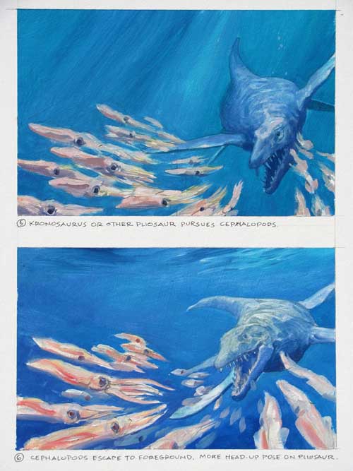
In the October issue of Ranger Rick, an article on ancient sea monsters starts off with a giant pliosaur swimming right toward us.
Here was the first sketch for it, drawn in water-soluble colored pencils. The big sea creature is chasing down a bunch of squid-like cephalopods, who are scattering in the foreground.


Before going to the finished painting, I did two small oil studies to give the art director some latitude for layout. But even though I got the green light to go to finish, I wasn’t feeling excited enough about the picture.

It wasn’t the design or the color that bothered me. The problem was that I didn’t care enough about the situation, because it’s hard to identify with invertebrates.

The solution was to show the big predator chasing a pair of sea turtles instead. We can feel for sea turtles, and we know from the fossil record that pliosaurs ate them. Framing the scene with big coral stands instead of open blue water also helped the drama.

The take-away point is that design alone isn’t enough (at least for me) to drive a picture. The story is just as important. If anything, the story should drive the design. And sometimes it takes sketch after sketch to nail down the story.
-------
Previous post on the Tylosaur, Part 1 and Part 2
Ranger Rick magazine

Thứ Hai, 25 tháng 10, 2010

Grafitti


Master graphic designer Leslie Cabarga regards graffiti writers as the “scribes of our day” and says: “I see graffiti as symptomatic of a culture that, at the leadership level, has little use for art or artists and relegates those of us with the most meager means to virtual outlaw status.”

from Cabarga's book: Logo, Font, and Lettering Bible.

Dinosaurs Invade Millburn

I spent last Friday with a high school art class in Millburn, New Jersey. We did a 4-hour workshop called DINOSAURS INVADE MILLBURN.

Each student had prepared a drawing of a street scene. Then they chose one of the scale dinosaur models that I brought along (There was also a flying monkey and a Bantha). They added the creatures to their scenes, keeping the perspective and lighting consistent.


It was a challenge, but the results were fabulous, a tribute to the students’ diligence and to the brilliant preparation of AP studio art teacher Kathleen Harte Gilsenan.